
François Truffaut Exhibition in Paris
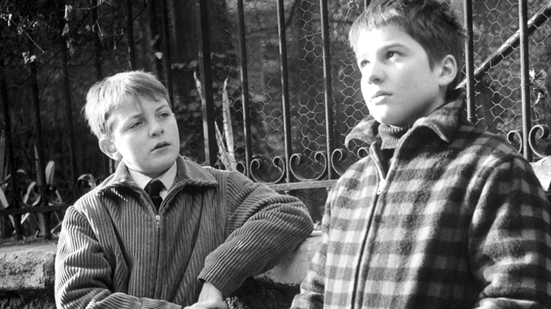
Image courtesy of Criterion.com. Scene from 400 Blows.
I am very excited to report that I will have the privilege to visit Paris' Cinémathèque Française for the exhibition of the Mister François Truffaut, this month. To add to the occasion, I have just discovered that Truffaut's grave sits in Montmartre cemetery, nearby.
Admittedly, I have only seen a couple of Truffaut's works, thus far. However, I think it a rare and memorable feat when a single film can challenge everything you think you know about cinema. For me, that film was 400 Blows. Despite having watched various French New Wave movies, never quite grasping either their concept or their significance, I felt that finally I was beginning to understand, as I was watching 400 Blows. For me, it was during the scene in which Antoine prays to his Balzac altar that re-ignited (no pun intended) my interest in French New Wave.
What a beautiful thing to be able to pinpoint the exact scene in which a film grabs you and won't let go. I have several such memories of specific films that I will cherish every time I watch them. I find that when this happens (on the unique occasion), that film ends up becoming one of my favorites.
While I'm still just skimming the surface of all things cinema, I am absolutely looking forward to seeing what the Cinémathèque Française can teach me.

Graphic Design in the Wes Anderson's film, "The Grand Budapest Hotel"

Wes Anderson's, "The Grand Budapest Hotel"
Last night I saw Wes Anderson's film, "The Grand Budapest Hotel". I like Wes Anderson enough, he's not my favorite, but it was an opportunity to get out of the rain and take advantage of Ritz' $7 movie Wednesdays, which is one of my favorite things in Philly.
What made me especially want to go see this particular film was because I read an article a couple days before about the graphic designer of the film, Annie Atkins. Basically, the article discussed all the elements of graphic design from packaging, signage, books, etc. that had to be created for the film. It was something I never actually considered before, but of course someone had to design all of those bits and pieces. What a dream job, right?
Paying careful attention to a movie purely for its graphic design qualities was interesting to me. Usually I reserve such a view for only title sequences. And maybe that's what I like best about Wes Anderson's films, just that it seems like he's presenting more, life-sized dioramas in that he's thinking about the artistic quality in a different way (and maybe that's not even the director's job anyway, I don't really know).
I thought Atkins' kerning was great and inspired me to explore this more in my own work. Each piece had the right attitude for the movie too, even at times comical.
Aside from Atkins' contributions, I have to mention the color palette of the film. I love seeing someone who's studied color theory mastering it in film, especially to see so in a theatre where everything looks particularly lush and vibrant.
And if you wanted my opinion of the film, 3/5 stars, maybe even 2.5/5. It's difficult to assess a movie's rating in its entirety when you become so bias towards the artistic quality of it, which I loved. Shucks.