Here's What I'm Doing to Stay Current as a Graphic Designer
I know what you're thinking: "Emily, how are you possibly staying current when you're working for a company that's mostly dealing with print?"
What a great question and a definitely something I'm aware of. In this day and age where the career paths of graphic designer, web designer, UX Designer, Front-End Developer, etc. are increasingly becoming more intertwined with one another, it's not enough to be a mere print designer. At the very least, it's essential that I have basic, working knowledge of these areas. Although the company that I work for currently does not offer continuing education courses or skill enrichment sessions, I've taken it upon myself to see what resources I can utilize both within the city that I live in and this wonderfully expansive thing called "the internet."

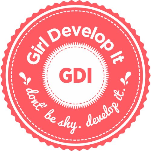
First, I've joined the Philadelphia chapter of the MeetUp group "Girl Develop It" who describe themselves as, "Girl Develop It is a nonprofit organization that exists to provide affordable and judgment-free opportunities for women interested in learning web and software development. Through in-person classes and community support, Girl Develop It helps women of diverse backgrounds achieve their technology goals and build confidence in their careers and their every day lives."
My first course starts in May and is called, "UX101: Intro to User Experience (UX)" and I'm really excited to not only learn about the subject, but to network and get to know others in the scene. I'm so so grateful that this company exists and is providing such wonderful, affordable education. Honestly, I have looked into certificate programs as well as adult programming courses at local colleges, but cost was always a major concern. Thanks Girl Develop It!

Second, I'm utilizing Aquent's online "Gymnasium." Aquent says the following about its wonderful resource, "We created Aquent Gymnasium to bridge the skills gap. The skills gap is getting in the way. It prevents companies from engaging customers across devices and taking advantage of emerging technologies. It also prevents digital, creative, and communications professionals from producing great work, delivering results and advancing their careers. Aquent Gymnasium bridges the skills gap by taking what we've learned from our clients and developing free, online courses that teach digital designers and front-end developers today's most in demand skills."
I love what Aquent says about its "Gym" and I couldn't agree more. Even to call it a "gym" implies "working out" skills, "stretching" your brain, "pushing yourself" to improve. I found this amazing resource while researching AIGA's "Career Resources and Tools" section, which I am a member of. Right now, I'm just enrolled in the introductory classes, but I'm going to take as many classes as they offer.
So that's what I'm up to. I hope that anyone reading this post recognizes my desire to grow as a designer, even if that means finding a way to do so, independent of the office. I'm taking the initiative and happily looking forward to achieving my goal of becoming a more well-rounded graphic designer. Who is current, of course.

An Unexpected Lesson in UX Experience & Design Trends

So I've been looking at a hell of a lot of design agency websites lately. From San Francisco to Malta to Norway, looking through so many sites, you tend to notice some things. Of course, I'm skimming the surface on topics that require further depth. But from my own observations, here's what I've found:
- I'm beginning to understand the horrible, excruciating pain of the User Experience Designer.
It seems to me that having to hit the "Back" button is a sin. In the best web designs that I've come across, there's an obvious flow to to make the user comfortable and maintain an intuitive sense of where things are, at all times. Informed choices by the UX Designer are executed in the smallest of details, such as whether a link opens in a new window or not. I particularly notice the attention to tiny details when it comes to navigating through lists. For example, for a job search, I may search for "graphic designer" in a specific site's Search button. A list of my results will pop up. I'll go through, click on a description to bring me to a new page that describes the job role more in depth. However, when I want to go back to that search-generated list? It has completely disappeared. Now I have to conduct my search all over again, specifying "graphic designer", specifying which locations, etc. The other option is for me, the user to right click all of the linked job description into new tabs or windows. Well, that's pretty annoying. I don't know if there's a term for this sort of thing, but for lack of better terms, I find that the best sites hold a "memory" of what my last page was. These are the same sites that never seem to rely on the user ever having to click the "Back" button. For me, to click on the back button within a website means that the user has gotten lost. And that's something you just don't want. I can't imagine how upsetting it is for a UX Designer to witness.
- Website navigation is now compact, and compartmentalized.
When I was first learning about web design in school, we were taught to format your navigation at the top of the page, spelled out so that users can find your pages easily. Nope, not any more. I noticed a great number of design agency websites now utilizing the "3 Bar Navigation Icon" that now opens up a drop-down menu of "About Us" or "Our Work" or "Contact". I like this method for a few reasons: One, we are actually trusting that the user is smart enough to figure it out on his/her own without literally spelling it out. Second, the work or portfolio is now even more front and center, since the Navigation Icon sits small, tucked off to the side.
- There were trends and I didn't even know there were trends.
Just through the repetition of looking at portfolio site after portfolio site, I kept noticing similarities in certain styles. This is just what I noticed in the U.S.A. Here's a few:
The diagonal phrase banner, wrapping around itself.
Then there was the "Geometrification" of common objects. Now an elephant is not just an illustration of an elephant, but a geometric/Picasso-esue elephant with sharp angles and abstract forms.
Big push towards hand-lettering, which I'm a big fan of. However, even more so, I picked up on the chalk typography for restaurant menus.
- Google is taking over the world. Like, seriously.
Oh, Google. You are so much larger than I even know. My lesson learned here resulted from an issue I was having with my Snippet segment of my website. When using the web to search my site, I noticed that my website description was not the one I inputted, but rather, a segment from one of the specific projects on my site. I contacted Squarespace who clarified that I was inputting all my data correctly, but it had something to do with Google's WebMaster Tools. Huh? I don't even want to talk about it; it was that much of a traumatic experience. But to sum it up, I ended up looking into definitions of things I didn't even know existed, words like "crawling" or "fetching robots". My lesson learned here is just to say that while something may be laid out correctly within a site's structure, you still have to do the work to make sure that your site is communicating with Google in the most optimal way. And you'll need a professional to help you with this, because it was beyond me. So, bottom line? Ask for help. There are things not within your scope.