career, education

How Punk Rock Has Made Me a Stronger Designer

I just filled out an application to become a part-time graphic design teacher at an alternative school. Naturally, the first question they ask is why do you want to be a teacher. In many ways, I had to stop myself from typing, "BECAUSE F*CK THE ESTABLISHMENT, THAT'S WHY!" And while I didn't think that starting off an application with a slew of curse words longer than a N.W.A. song was the best idea, the overall sentiment is perhaps still the same. 

I said I was interested in teaching because:

  • I'd like to offer exposure to atypical career trajectory
  • Want to encourage alternative education in the forms of what's available in public access, community, self-taught whatever, etc.
  • I'm more of an asker than a teller. I explained how I just read a book called, Humble Inquiry which says that the most dangerous thing in American culture is that we tend to do a ton more telling than asking. As a result, people are made to feel dumb for asking questions and keep quiet. Humility is not valued in this type of environment. I'd love to create a classroom focused more on asking questions rather than telling students what I know, what they did wrong, etc. I feel this is especially valuable in an artistic classroom where, isn't design subjective anyway?
  • Celebrate students' authenticity. Both personal and professional
  • Don't want students to make the same mistakes I did or am still making

I wish I could change that last bullet to a past-tense phrase but truth-be-told, I am still making many, many mistakes in my career. Most recently, I'm upset with forgetting who I am and what I believe in, especially in the workplace. When I think about what I value, I care about real art/design (art-art, performance art, film, music, etc.). I care about work/life balance. I try to be healthy and environmentally conscious. And people/culture. I care about connections and relationships with people. 

So where does punk rock come into play in all this? 

As a former dedicated member of the Misfits field club and attender of hundreds and hundreds of small DIY shows, I've learned so many more valuable lessons in teamwork, dedication, and community than I ever had in any corporate office. Let's not forget what punk rock teaches above all else: that you should be free to be whoever you want to be. Don't let society tell you what defines success and what it looks like. Refuse to be put in a box, especially in a box that someone else made for you. "Do It Yourself," a core value of punk rock, is the ultimate reminder to find your own way to do you. 

If I'm able to go into a classroom and teach students to DIY their design, their life, whatever and to offer them a safe space to explore/reclaim/question/confirm who they are, that would be an establishment that I would be proud to be a part of. An anti-anti establishment, of course.


New York City: A Love Letter (Part I)

I am deliciously in love. And while I'd like to tell you that the victim is either Tom Hardy, Javier Bardem, or my old flame by the name of Jack Daniels, I have to confess that this time it is even a less-likelier candidate than the latter. The name? New York City.

With my 1-year NYC anniversary recently celebrated, and with a fast-approaching Valentine's Day around the corner, I thought it beautifully appropriate to pause and reflect on this city who has so simultaneously viciously and tenderly grabbed hold of me.

While some of you out there may be celebrating this upcoming "lover's" holiday with romantic intent, let me remind you that the wonderful thing about love is that it can come in numerous shapes and forms. For me, it comes in the unexpected form of a marvelous, gregarious, ballsy city, and isn't that how we stumble into love anyway? Surprised, baffled, unprepared, definitely unqualified, but nonetheless forever changed.

This city has changed me, seen the best of me, and absolutely witnessed the worst of me. Isn't that what a good relationship is? Someone who will accept you as you were, as you are, and as you intend to be. Someone who allows you to be vulnerable, afraid, sometimes strong and sometimes not.

I've been tired, exhausted, and down-right spent and you know what I've learned? That it's okay. In "the city that doesn't sleep", there's no guarantee. It's a city that seems to scream, "NOT TOMORROW, NOT LATER, BUT NOW, NOW, NOW!!!" You will be pushed, challenged, made to feel totally uncomfortable, but that's exactly what I need/want in a partner: Someone who will unapologetically demand that I grow, that I forget everything I think I know about my "limitations", and that I finally, finally begin the process of living life by my own definition.

And so I leave you with a quote by the author, poet, dreamer Daphne Rose Kingma because I'm eager to write Part II of this soon,

"What do you need? Who do you need to ask for exactly the piece of love you need right now? And do you have the guts, vulnerability and humility to reach out and ask for it?"

With New York, I've asked and was given in a way I could not have imagined. Thank you. New York, I <3 you.


How Do You Define a "Professional"?

Recently, I was discussing with someone the Brooklyn public library's availability of the Adobe Suite on Macs. To my surprise, she was adamantly opposed to this notion, exclaiming that there would be no way to distinguish between the "professional" and "any old person" claiming to be so.

I hesitated because I knew what she was referring to. I've seen it on Etsy, Shutterstock, and similarly mass stock, templated sites where someone who isn't qualified for the job is submitting vector icons that aren't vectored, let alone pathfinded or separated onto layers. I've witnessed people promoting logo design capabilities by smooshing two letters together and calling it a day. These kinds of un-certified wannabes are frustrating to the people who have learned, in some capacity, the "right" and "wrong" in graphic design in terms of technical skills.

However, claiming to be a professional too often refers to hard skill sets when it should also refer to professional behavior. Belittling or degrading people who maybe don't know as much as you is the lowest and least form of professionalism. In being a part of graphic design, a profession often referred to as "visual communication", isn't the goal precisely about dialogue and opening up pathways for opportunity? Communication is a balance between speaking and hearing. It's about learning something new from one another, sharing ideas on both ends. You cannot claim to be a graphic designer, let alone a professional, if you refuse to strengthen your skills in open dialogue. It seems to me that if a professional chooses to judge someone who isn't as knowledgeable in the subject at hand, and yet doesn't offer to teach what they know to that individual, he/she has just closed the door on the very basis of graphic design: conversation. Instead of criticizing someone with less developed technical skills, why not offer to help? Use your expertise to give suggestions, to advise, to listen. A selfish designer is not a professional, but an empathetic one just might be.

"What Would You Call it if the Adobe Suite Was Suddenly Free? ....an alternative universe?" (shout-out to the Brooklyn public library)

Upon finally receiving my Brooklyn public library card, I ventured over to the Central location–what would become my new home in the job search process. I don't know what kind of working environment I was expecting, but nothing (and I mean nothing) would have prepared me for what I would soon discover: this library has designated Mac computers fully equipped with the Adobe Suite.

When the librarian told me this, my jaw dropped. Game-changer.

Even days, weeks later I am obsessing over this idea. This software is averaging some $960/yr or if a person has a 30 year career, that is $28,800 spent on a tool that is practically mandatory in the industry. That leads me to the question of: Who do we leave behind when have these kinds of limitations? Essentially, we are saying that in the graphic design field, we are only willing to educate those of us who can afford "tools" of the trade. I say "tools" in this way because as much as we are taught that the computer is just a tool, the industry has shifted so dramatically that most current/modern graphic design studios won't look twice at you if you don't have a computer background.

So what is someone who is passionate about graphic design supposed to do if he/she isn't financially stable enough to purchase the Adobe Suite (let alone the notion of affording a college education)? This bothers me so much because our industry doesn't feel much like art to me anymore. The beauty about being an artist is the flexibility, resourcefulness, and freedom in the craft. You hear these romantic stories how a painter can't afford to buy canvas so he/she works on cardboard. An illustrator didn't have a college education, but self-taught himself/herself because he/she picked up some used books on figure drawing. These examples demonstrate the liberty of option. But in graphic design, we have decided that options do not exist. You must buy the Adobe Suite in order to be taken seriously in a modern design studio. Art should be about accessibility, not consumerism. Just because a corporate giant has a monopoly on software doesn't mean it should be the only choice.

This is exactly why the Brooklyn public library's free access to the Adobe Suite is so valuable. Regardless of financial background, if you want to learn graphic design, to play around with Photoshop, you can. Not only that, but if you can't afford a college education or just want to brush up on your skills, the library also provides free access to Lynda.com (video tutorials on all things computer-design related). What the library is doing is giving options in allowing public access to graphic design. That is huge.

education

Here's What I'm Doing to Stay Current as a Graphic Designer

I know what you're thinking: "Emily, how are you possibly staying current when you're working for a company that's mostly dealing with print?"

What a great question and a definitely something I'm aware of. In this day and age where the career paths of graphic designer, web designer, UX Designer, Front-End Developer, etc. are increasingly becoming more intertwined with one another, it's not enough to be a mere print designer. At the very least, it's essential that I have basic, working knowledge of these areas. Although the company that I work for currently does not offer continuing education courses or skill enrichment sessions, I've taken it upon myself to see what resources I can utilize both within the city that I live in and this wonderfully expansive thing called "the internet."


First, I've joined the Philadelphia chapter of the MeetUp group "Girl Develop It" who describe themselves as, "Girl Develop It is a nonprofit organization that exists to provide affordable and judgment-free opportunities for women interested in learning web and software development. Through in-person classes and community support, Girl Develop It helps women of diverse backgrounds achieve their technology goals and build confidence in their careers and their every day lives."

My first course starts in May and is called, "UX101: Intro to User Experience (UX)" and I'm really excited to not only learn about the subject, but to network and get to know others in the scene. I'm so so grateful that this company exists and is providing such wonderful, affordable education. Honestly, I have looked into certificate programs as well as adult programming courses at local colleges, but cost was always a major concern. Thanks Girl Develop It!


Second, I'm utilizing Aquent's online "Gymnasium." Aquent says the following about its wonderful resource, "We created Aquent Gymnasium to bridge the skills gap. The skills gap is getting in the way. It prevents companies from engaging customers across devices and taking advantage of emerging technologies. It also prevents digital, creative, and communications professionals from producing great work, delivering results and advancing their careers. Aquent Gymnasium bridges the skills gap by taking what we've learned from our clients and developing free, online courses that teach digital designers and front-end developers today's most in demand skills."

I love what Aquent says about its "Gym" and I couldn't agree more. Even to call it a "gym" implies "working out" skills, "stretching" your brain, "pushing yourself" to improve. I found this amazing resource while researching AIGA's "Career Resources and Tools" section, which I am a member of. Right now, I'm just enrolled in the introductory classes, but I'm going to take as many classes as they offer.

So that's what I'm up to. I hope that anyone reading this post recognizes my desire to grow as a designer, even if that means finding a way to do so, independent of the office. I'm taking the initiative and happily looking forward to achieving my goal of becoming a more well-rounded graphic designer. Who is current, of course.

career

So You Don't Want to Hire Me Because I Live in Philly? Here's What You're Missing.

I can't tell you how many times I've read through exciting, compelling job opportunity descriptions only to come to the end where it says in fine print, "Local candidates only." Granted, I can see some benefits to this. First, a company doesn't want to pay for someone to move, especially if it's not guaranteed that the candidate will stay. Budgets are tight, let alone dealing with the waiting period of said candidate packing up and shipping out to your location. Second, there are regional traditions, cultures, language conflicts of interest to consider. It's kind of awkward when your Japanese co-workers chow down on Yaki Imo and all you've got is your American peanut butter and jelly with the crusts chopped off. Need a 300dpi, CMYK photo optimized for mobile? Good luck asking for that in Finnish since the only two languages you wrote down in the "Language Fluency" section were English and Pig Latin.

I get it. It's a risk. But when we talk about the cost of having an "out-of-towner" come work for your company, are we talking about monetary cost or are we talking cost value? There's a real difference between the two and it's not always clear which a company is asking for. Can you put a price on an exceptional, loyal, trustworthy candidate? One who works seamlessly with others, implements improved standards, takes initiative to not only better him/herself but also to better the company as a whole? Value cannot be defined (or should I say confined?) to distance.

Aside from bringing inherent professional characteristics to a job, I could also bring useful, practical Philly skills to the workplace, wherever that may be. You say you want a candidate with strong, verbal communication? Try debating with your Geno's Cheese Steaks-loving, South Philly neighbor on why you think Pat's Cheese Steaks is better. Not only do you need to hold your own in the argument for an appalling length of time (South Philly natives do NOT back down), you have to have the evidence to back it up. We're talking variables such as average wait time, courteousness of staff, selection of toppings, etc. So anytime a company requests that the candidate "Considers all possible outlets of a project", I have to chuckle; that's easy. Try problem-solving when the #23 bus is experiencing delays, traffic is bumper-to-bumper on highway 76, and the subway is shut-down because someone delivered a baby (true story). Seeing alternative possibilities is what this Philly girl does on a daily basis. I recognize that one way of thinking, one way of getting from point A to point B isn't going to work.

Similarly, one type of person isn't going to benefit anyone either. If it's true what they say about a person being a "product of their environment", wouldn't a company want to diversify their products? The beautiful thing about people from a variety of places is a different way of seeing; unique perspectives making it certain that a company does not stay stagnant in their approach.

For all the companies who claim not to discriminate on the basis of race, color, religion, sex, age, etc. maybe you could also include "location" on the list. Because now you know exactly what you are missing, and at what cost?


web design

An Unexpected Lesson in UX Experience & Design Trends

So I've been looking at a hell of a lot of design agency websites lately. From San Francisco to Malta to Norway, looking through so many sites, you tend to notice some things. Of course, I'm skimming the surface on topics that require further depth. But from my own observations, here's what I've found:
 

  1.  I'm beginning to understand the horrible, excruciating pain of the User Experience Designer.
    It seems to me that having to hit the "Back" button is a sin. In the best web designs that I've come across, there's an obvious flow to to make the user comfortable and maintain an intuitive sense of where things are, at all times. Informed choices by the UX Designer are executed in the smallest of details, such as whether a link opens in a new window or not. I particularly notice the attention to tiny details when it comes to navigating through lists. For example, for a job search, I may search for "graphic designer" in a specific site's Search button. A list of my results will pop up. I'll go through, click on a description to bring me to a new page that describes the job role more in depth. However, when I want to go back to that search-generated list? It has completely disappeared. Now I have to conduct my search all over again, specifying "graphic designer", specifying which locations, etc. The other option is for me, the user to right click all of the linked job description into new tabs or windows. Well, that's pretty annoying. I don't know if there's a term for this sort of thing, but for lack of better terms, I find that the best sites hold a "memory" of what my last page was. These are the same sites that never seem to rely on the user ever having to click the "Back" button. For me, to click on the back button within a website means that the user has gotten lost. And that's something you just don't want. I can't imagine how upsetting it is for a UX Designer to witness.
     
  2. Website navigation is now compact, and compartmentalized.
    When I was first learning about web design in school, we were taught to format your navigation at the top of the page, spelled out so that users can find your pages easily. Nope, not any more. I noticed a great number of design agency websites now utilizing the "3 Bar Navigation Icon" that now opens up a drop-down menu of "About Us" or "Our Work" or "Contact". I like this method for a few reasons: One, we are actually trusting that the user is smart enough to figure it out on his/her own without literally spelling it out. Second, the work or portfolio is now even more front and center, since the Navigation Icon sits small, tucked off to the side.
     
  3. There were trends and I didn't even know there were trends.
    Just through the repetition of looking at portfolio site after portfolio site, I kept noticing similarities in certain styles. This is just what I noticed in the U.S.A. Here's a few:

    The diagonal phrase banner, wrapping around itself.

    Then there was the "Geometrification" of common objects. Now an elephant is not just an illustration of an elephant, but a geometric/Picasso-esue elephant with sharp angles and abstract forms.

    Big push towards hand-lettering, which I'm a big fan of. However, even more so, I picked up on the chalk typography for restaurant menus.
     
  4. Google is taking over the world. Like, seriously.
    Oh, Google. You are so much larger than I even know. My lesson learned here resulted from an issue I was having with my Snippet segment of my website. When using the web to search my site, I noticed that my website description was not the one I inputted, but rather, a segment from one of the specific projects on my site. I contacted Squarespace who clarified that I was inputting all my data correctly, but it had something to do with Google's WebMaster Tools. Huh? I don't even want to talk about it; it was that much of a traumatic experience. But to sum it up, I ended up looking into definitions of things I didn't even know existed, words like "crawling" or "fetching robots". My lesson learned here is just to say that while something may be laid out correctly within a site's structure, you still have to do the work to make sure that your site is communicating with Google in the most optimal way. And you'll need a professional to help you with this, because it was beyond me. So, bottom line? Ask for help. There are things not within your scope.


film, Museums/Galleries, people

François Truffaut Exhibition in Paris

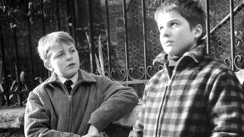
Image courtesy of Criterion.com. Scene from 400 Blows.

Image courtesy of Criterion.com. Scene from 400 Blows.

I am very excited to report that I will have the privilege to visit Paris' Cinémathèque Française for the exhibition of the Mister François Truffaut, this month. To add to the occasion, I have just discovered that Truffaut's grave sits in Montmartre cemetery, nearby.

Admittedly, I have only seen a couple of Truffaut's works, thus far. However, I think it a rare and memorable feat when a single film can challenge everything you think you know about cinema. For me, that film was 400 Blows. Despite having watched various French New Wave movies, never quite grasping either their concept or their significance, I felt that finally I was beginning to understand, as I was watching 400 Blows. For me, it was during the scene in which Antoine prays to his Balzac altar that re-ignited (no pun intended) my interest in French New Wave.

What a beautiful thing to be able to pinpoint the exact scene in which a film grabs you and won't let go. I have several such memories of specific films that I will cherish every time I watch them. I find that when this happens (on the unique occasion), that film ends up becoming one of my favorites.

While I'm still just skimming the surface of all things cinema, I am absolutely looking forward to seeing what the Cinémathèque Française can teach me.

Museums/Galleries

Jeff Koons Retrospective

Jeff Koons, Tulips, 1995–98. Oil on canvas; 111 3⁄8 × 131 in. (282.9 × 332.7cm). Private collection. © Jeff Koons

Jeff Koons, Tulips, 1995–98. Oil on canvas; 111 3⁄8 × 131 in. (282.9 × 332.7cm). Private collection. © Jeff Koons

Last weekend I had the pleasure of attending the Whitney Museum in New York City. Admittedly, I had never been to the Whitney which I know is a crime. But, alas, I finally made it there and what a memorable experience!

First, to discover that Marcel Breuer is the architect was exciting to me, as he's one of my favorite Bauhaus designers. The impression that the building makes is a unique one: there's a heaviness to the structure that balances the open space given to the artwork itself. Dark, intimate stairwells and elevators give stark contrast to light emanating from each, airy floor. 

Beginning at the top level, we meandered amongst the Basquiat's, Johns', Calder's, Haring's. To see such a concentrated amount of influential artists in one setting was...awe-inspiring. Is there a better word? It's a type of silent excitement that escapes through the form of sparkles in your eyes because you have no words.

And just as I thought I couldn't be more impressed, the Jeff Koons retrospective. To be fair, I wasn't a big fan of Koons' work, from what I knew of it. Although I had appreciated the effect he has on gathering a young, contemporary audience (energetic, vivacious, fashionable), I guess I just didn't really get it, to be honest. So what, this guy makes these metallic balloon-looking things and cartoon-ish sculptures that are a little bit PG-13?

However, one of my favorite themes in life is to be proven wrong. And thank god, right? If I stayed stuck in my mind and my opinion, how am I supposed to learn anything? My, oh my did this Jeff Koons restrospective teach me a thing or two.

If you aren't familiar with Koons work, I highly recommend visiting Artsy.com, it's a fantastic resource for all things art, with a modern interface that makes learning and discovery of new artists, mediums, and movements a breeze. In summary, his body of work impressed me with its cohesiveness. Yes, there's a vast range of mediums, ideas, themes, and yet, I see progression. To see Koons' work in his earlier years compared to later years really demonstrated (to me) a sense of learning, of advancing, of pushing personal boundaries and goals. He stays grounded in his convictions but uses that as a base to try new ideas.

I learned about the play between materials and medium versus final execution. To read about Koons' consideration of expensive, luxurious materials used to create everyday objects intrigued me. It begs the question, what makes anything valuable? I can't help but think that Koons is teasing us a little bit, "Hey it's an animal balloon, but that's gonna cost you a couple million." That's funny and fresh.

Koons and sex. I'd gather that Koons is a business man. What sells? People love gimmicks, so here's a golden Michael Jackson. People also love sentiment so maybe let's combine some childhood toys and objects with works of fine art. And what else sells? Sex sells. I think the same tone Koons uses to market any of his art is achieved in the same approach with his more obviously sexualized pieces. He does it in a humorous, glaring way. To me, it was funny and awkward and can't that also be true of sex? When we talk about anything sexual regarding art, we tend to think so traditionally: Matisse's "Blue Nude" or Michelangelo's "David" just because they feature naked bodies. In American culture where it seems that the lines of sex, sexuality, sensuality seem to get tossed into the same pool, I think Koons tries to have a conversation about the differences. Maybe I'm just reading too far into it. But when Koons tells me that a vacuum cleaner has parts of the female and male anatomy, then mentions the words, "sucking and blowing", will I ever be able to look at vacuum cleaners the same? Have we sexualized the everyday or are we just out of touch with it?

Infinitely interesting. A million questions, and that's what good art does.

lecture/discussion

A Conversation on Art & Music

Robert Mapplethorpe, Self Portrait, 1980, © Robert Mapplethorpe Foundation

Robert Mapplethorpe, Self Portrait, 1980, © Robert Mapplethorpe Foundation

The other day, I was delighted to have a conversation with a perfect stranger on the following topics:

1. Turner
2. Mapplethorpe
3. Pollock
4. the MoMa
5. Whitney
6. ICA (Philly)
7. Toulouse Latrec
8. Klimt
 

Not to mention the music of:
1. Nick Cave & the Bad Seeds
2. Boris
3. Sunn O))))
4. Flamenco
5. classical (Ravel, Beethoven)
6. Killing Joke
7. Sharon Jones & the Dap Kings
8. 60s French Pop (Serge Gainsbourg, Les Chats Sauvages)

I will also add that the pleasure of discussing Grado and Sennheiser headphones gave me a great thrill. Audio compression. Amplifiers.

Oh, and garlic. Spanish cuisine.

And the following question:
"Is your graphic design static or dynamic?"


What better conversation to have? Next up, film and literature.


Harvard Psychologist Jerome Bruner on Creativity

From BrainPickings:
Bruner proposes six essential conditions of creativity:

  1. Detachment and commitment. A willingness to divorce oneself from the obvious is surely a prerequisite for the fresh combinatorial act that produces effective surprise. there must be as a necessary, if not a sufficient, condition a detachment from the forms as they exist… But it is a detachment of commitment. For there is about it a caring, a deep need to understand something, to master a technique, to render a meaning. So while the poet, the mathematician, the scientist must each achieve detachment, they do it in the interest of commitment. And at one stroke they, the creative ones, are disengaged from that which exists conventionally and are engaged deeply in what they construct to replace it.
  2. Passion and decorum. By passion I understand a willingness and ability to let one’s impulses express themselves in one’s life through one’s work… Passion, like discriminating taste, grows on its use. You more likely act yourself into feeling than feel yourself into action… But again a paradox: it is not all urgent vitality. There is decorum in creative activity: a love of form, an etiquette toward the object of our efforts, a respect for materials… So both are necessary and there must surely be a subtle matter of timing involved — when the impulse, when the taming.
  3. Freedom to be dominated by the object. You begin to write a poem. Before long it, the poem, begins to develop metrical, stanzaic,symbolical requirements. You, as the writer of the poem, are serving it — it seems. or you may be pursuing the task of building a formal model to represent the known properties of single nerve fibers and their synapses: soon the model takes over… There is something odd about the phenomenon. We externalize an object, a product of our thoughts, treat it as “out there.” Freud remarked, commenting on projection, that human beings seem better able to deal with stimuli from the outside than from within. So it is with the externalizing of a creative work, permitting it to develop its own being, its own autonomy coming to serve it. It is as if it were easier to cope with there, as if this arrangement permitted the emergence of more unconscious impulse, more material not readily accessible…

    To be dominated by an object of one’s own creation — perhaps its extreme is Pygmalion dominated by Galatea — is to be free of the defenses that keep us hidden from ourselves.

    As the object takes over and demands to be completed “in its own terms,” there is a new opportunity to express a style and an individuality. Likely as not, it is so partly because we are rid of the internal juggling of possibilities, because we have represented them “out there” where we can look at them, consider them.

  4. Deferral and immediacy. There is an immediacy to creating anything, a sense of direction, an objective, a general idea, a feeling. Yet the immediacy is anything but a quick orgasm of completion. Completion is deferred…

    Having read a good many journals and diaries by writers I have come to the tentative conclusion that the principal guard against precocious completion, in writing at least, is boredom. I have little doubt that the same protection avails the scientist. It is the boredom of conflict, knowing deep down what one wishes to say and knowing that one has not said it. one acts on the impulse to exploit an idea, to begin. One also acts on the impulse of boredom, to defer. Thus Virginia Woolf, trying to finish Orlando in February 1928: “Always, always, the last chapter slips out of my hands. One gets bored. One whips oneself up. I still hope for a fresh wind and don’t very much bother, except that I miss the fun that was so tremendously lively all October, November, and December.

  5. The internal drama. There is within each person his own cast of characters* — an ascetic, and perhaps a glutton, a prig, a frightened child, a little man, even an onlooker, sometimes a Renaissance man. The great works of the theater are decompositions of such a cast, the rendering into external drama of the internal one, the conversion of the internal cast into dramatis personae…

    As in the drama, so too a life can be described as a script, constantly rewritten, guiding the unfolding internal drama. It surely does not do to limit the drama to the stiff characters of the Freudian morality play — the undaunted ego, the brutish id, the censorious and punitive superego. Is the internal cast a reflection of the identifications to which we have been committed? I do not think it is as simple as that. It is a way of grouping our internal demands and there are idealized models over and beyond those with whom we have special identification — figures in myth, in life, in the comics, in history, creations of fantasy…

    It is the working out of conflict and coalition within the set of identities that compose the person that one finds the source of many of the richest and most surprising combinations. It is not merely the artist and the writer, but the inventor too who is the beneficiary.

  6. The dilemma of abilities. What shall we say of energy, of combinatorial zest, of intelligence, of alertness, of perseverance? I shall say nothing about them. They are obviously important but, from a deeper point of view, they are also trivial. For at any level of energy or intelligence there can be more or less of creating in our sense. Stupid people create for each other as well as benefiting from what comes from afar. So too do slothful and torpid people. I have been speaking of creativity, not of genius.

music

Bossa nova king Luiz Bonfá with Fellini-esque cinematography? Swooning.

This is so amazingly great. What a gorgeous sound!


But whoever shot the performance did an equally amazing job. I think the best use of video in music highlights the sound, without distracting the audience. It reminds me a bit of Fellini, just from what I've seen of his with the high contrast and unique angles of panning in on people.

I wish music performances were still shot this way, in such an intentional artistic sense.

people

A proper Maui thank-you

"Aloha ___________ !
  Please forgive my lateness in writing you this thank you, but better late than never, I suppose. Maybe you'd understand the difficulty in expression via words rather than say, a sculpture or a painting! That being said, I'd like to still try: I did want to thank you for welcoming my friend and I into your conversation about art. Of course it was a great surprise for us to be offered such an intimate opportunity–I had a blast!

  Aside from that, I think I was just relieved to come across someone so accessibly and enthusiastically representing artists. In the past, I've found people removed maybe both physically and emotionally and how can anyone ever feel connected to a work if that's the case? To be emotionally invested makes all the difference. I guess I still have this crazy, romantic hope that people still do things out of passion, which seems to be your case? It shows, so I just wanted to offer a little thanks.

 Genuinely,
 Emily Ballas (from Philly)


“Even as it applies to the individual, art is a heightened mode of existence. It gives deeper pleasures, it consumes more quickly. It carves into its servants’ faces the marks of imaginary and spiritual adventures and though their external activities may be as quiet as a cloister, it produces a lasting voluptuousness, over-refinement, fatigue, and curiosity of the nerves such as can barely result from a life filled with illicit passions and enjoyments.”

– Thomas Mann, Death in Venice

event, lecture/discussion

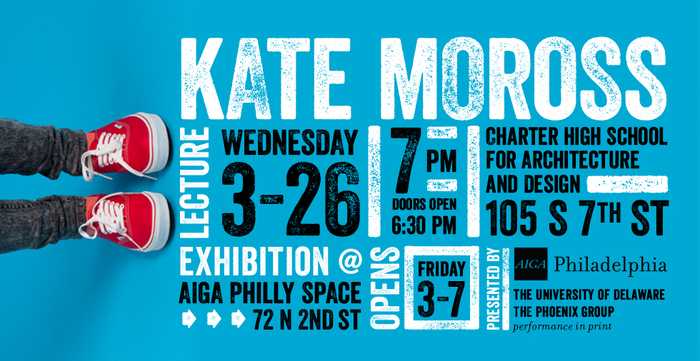
Kate Moross Lecture, with a side of Wes Anderson

Went to this talk last night. Many times I'm just riddled with jealousy in going to these things because people are doing, making, saying, thinking the most interesting things. And they have others surrounding and inspiring them, collaborating.

Moross is young but ambitious. What I like most about her is her willingness to try anything, even though she may not know how to do it. She says "yes" to experimentation and has the confidence to convince others to give her a try. It's refreshing to see that.

What I've grown to loathe about the "corporate world" (in terms of graphic design) is the lack of experimentation. It's maddening to me to think that as a designer, you are supposed to have a set style and look and feel. What fun is that? I understand the importance of branding yourself and creating a nichė market, but that's not for me. I crave change and pushing boundaries and testing what you can get away with. This is the type of mentality that Moross also seems to possess, so I felt a kindred spirit with her.

At some point in her talk, Moross discusses her transition into working in film, more specifically music videos. And she said something that really rang true for me: "I never really understood why there's so much story-telling in music videos that has nothing to do with the type of music presented. To me, I try to artistically convey what the musician wants to communicate and how their music feels, visually." Now that's paraphrased of course, but I really appreciated why she said this. I often think similarly and wish that music videos just spoke for the music itself rather than distracting the audience with a story. That's not to say that there aren't beautifully successful music videos, but I think the best ones out there accurately reflect the musician's or the band's emotional response.

I mention Wes Anderson because when Moross commented on using film to visually represent rather than to tell a story, I thought of "Grand Budapest Hotel". Now, in the recent conversations I've had with friends about Anderson's latest release, we've all seemed to come to the same conclusion: the film was exquisitely shot and beautifully saturated with color, but the plot was yet to be desired. I couldn't help but wonder that if Anderson focused less on the narrative, and more about the visual, he might make an amazing music video director, or a director who works with films not containing much dialogue at all. I would love, love love to see him do this and I hope that he does.


The last point I'll acknowledge is about the final thought Moross left us with: "Don't be lazy". She said it so casually, but with a juvenile energy that could have only been spoken by someone not jaded by rejection or defeated by inhibition. Sigh. So simple, so right.

film

Graphic Design in the Wes Anderson's film, "The Grand Budapest Hotel"

Wes Anderson's, "The Grand Budapest Hotel"

Wes Anderson's, "The Grand Budapest Hotel"

Last night I saw Wes Anderson's film, "The Grand Budapest Hotel". I like Wes Anderson enough, he's not my favorite, but it was an opportunity to get out of the rain and take advantage of Ritz' $7 movie Wednesdays, which is one of my favorite things in Philly.

What made me especially want to go see this particular film was because I read an article a couple days before about the graphic designer of the film, Annie Atkins. Basically, the article discussed all the elements of graphic design from packaging, signage, books, etc. that had to be created for the film. It was something I never actually considered before, but of course someone had to design all of those bits and pieces. What a dream job, right?

Paying careful attention to a movie purely for its graphic design qualities was interesting to me. Usually I reserve such a view for only title sequences. And maybe that's what I like best about Wes Anderson's films, just that it seems like he's presenting more, life-sized dioramas in that he's thinking about the artistic quality in a different way (and maybe that's not even the director's job anyway, I don't really know).

I thought Atkins' kerning was great and inspired me to explore this more in my own work. Each piece had the right attitude for the movie too, even at times comical.

Aside from Atkins' contributions, I have to mention the color palette of the film. I love seeing someone who's studied color theory mastering it in film, especially to see so in a theatre where everything looks particularly lush and vibrant.

And if you wanted my opinion of the film, 3/5 stars, maybe even 2.5/5. It's difficult to assess a movie's rating in its entirety when you become so bias towards the artistic quality of it, which I loved. Shucks.

career

Dad Always Knows Best

When I was in middle school or high school, my dad brought home several VHS tapes on how to become an engineer, "I think you'd be really good at it," he said. I watched the tapes, didn't really get it, and opted to apply to Drexel under Music Industry. However, I applied late and the program was capped so they couldn't fit me in. Instead, I was accepted under my second choice, Interior Architecture. Did that for two years then changed my mind again to Graphic Design.

And now I'm thinking my Pops was right all along and that, at heart, I'm a problem solver, a builder, experimenter. My heart is in 3-D. I love, love graphic design but I want it to come off the page. Can you imagine a Russian constructivist poster built in 3-D, and then movable? 

Source: http://www.geocities.com/Athens/Delphi/9009/stengal.htmlThe Man with the Movie Camera, '29 (Chelovek s Kinoapparatom) USSR, '29Museum of Modern Art, New York, Arthur Drexler FundThis poster was created by Vladimir and Georgii Stenberg, who w…

Source: http://www.geocities.com/Athens/Delphi/9009/stengal.html

The Man with the Movie Camera, '29 (Chelovek s Kinoapparatom) USSR, '29Museum of Modern Art, New York, Arthur Drexler Fund

This poster was created by Vladimir and Georgii Stenberg, who were members of a group of artist engineers in the early Soviet Union. The brothers created posters to promote films that embody the constructivist style. This poster uses a montage of several drawings and designs from the film. It uses contrasting colours and simple designs and geometric shape. There is also a very strong emphasis on technology (the camera), which persists in constructivist art.

Imagine the possibilities in transforming this piece, that way. I don't mean sculpture, I mean moving, interacting, etc.

I should have paid more attention when all the birthday cards I ever made anyone were based on simple mechanics. Pop-up cards, movable parts, textured variations, die-cuts and elements of surprise.


Of course now, the concern becomes hire-ability. I'll have to start building on my own and market it enough that hopefully someone wants to hire me based on that. What jobs do I take? My heart sank when I watched that Wayne White documentary because he did, and is still doing, what I would prefer to be doing, at least as far as the prop building, experimenting goes.


Here's some words that should be associated with me:
1. experimenter
2. builder
3. lover
4. story-teller
5. problem-solver
6. interactor
7. guerilla art enthusiast
8. magician
9. beautifier
10. listener
11. giver
12. collaborator
13. communicator
14. (endlessly more)

Also, I feel like many of the newest technologies have the illusion of human interaction but do not actually achieve it. It's kind of like when American history class used to tell us that the U.S. was a melting pot of different people and cultures. Then later they said that that wasn't actually accurate, and what was more true was viewing the U.S. as a tossed salad: each culture is still its own separate entity, not actually mixing together. I'd be interested in melting things together again, so to speak.
 

lecture/discussion

Jonah Berger's, "Contagious–Why Things Catch On"

The other day at work, and somehow, we hosted a discussion with author Jonah Berger and his new book, Contagious–Why Things Catch On.

All employees received an email briefly highlighting the accomplishments of Mr. Berger, everything from his latest work (a New York Times bestseller) to being a professor for the Wharton School of Business at the University of Pennsylvania. I didn't know anything about him or his book but I figured it was an hour and a half out of the work day for me so why not.

He was the best presenter I've seen in quite some time: engaging, witty, thought-provoking. Turns out his new novel is about marketing/advertising, but not in the traditional sense. He seemed to present more the psychological aspect of the business, not necessary the numbers and the statistics. Berger argues that good advertising and marketing tells stories because people want stories, something emotional to relate to on a personal level. This delighted me, seeing that my own, personal design philosophy gravitates towards the emotional allure that design can have. It made me hopeful that maybe I have some of the right ideas that I can use in some better-suited career down the line. I find myself becoming more and more interested in using design to provide opportunities for its audience to reconnect and engage. I'm trying to figure out if, for me, that means more of an advertorial track (in a non-traditional sense) or what.

Aside from investing a personal interest in Berger's talk, I was particularly interested in how his advice could apply to my job. Being that I work at a newspaper, we make most of our money through advertising. There's countless arguments for why print is dead, particularly newspapers. And yeah, sure, I get it. But I hate when people say it; I wish instead their argument would be, "Print is dead–in the way that we know it." The difference being that one embraces technology and asks how it can either support print or how the two can marry to provide a complete product. I see so much potential, both from an advertising and marketing standpoint for these two platforms to complement each other.

One point that Berger made during his discussion was the idea of putting a "peanut butter with your jelly." He says that when seeing the phrase, "______________ and jelly", peoples' minds immediately pair the two together. Berger argues that the same has to be true for any audience. Give them a piece that automatically conjures up imagery/thoughts of the other.

To me, newspapers should also work this way. Newspapers should not be synonymous with print only, and yes,  I do think that if the newspaper industry is going to survive, it has to embrace a digital platform that complements its print counterpart, not replace it.


documentary

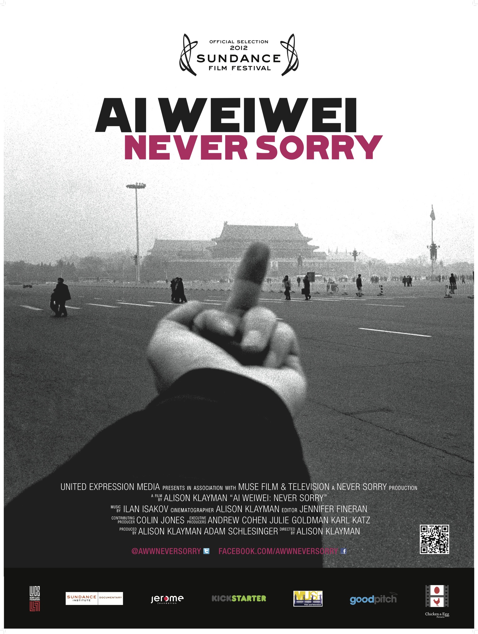
Ai Weiwei, Shutterstock, and oh, I don't know, comparing it all to life?

Never-Sorry-Poster2.jpg

"I think I’m actually an eternal optimist. I think optimism is whether you are still exhilarated by life, whether you are curious, whether you still believe there are possibilities. From this perspective, I am very much an optimist.” –Ai Weiwei


I finished up Ai Weiwei’s documentary tonight and something he talked about reminded me of something else that happened today.

This morning, I was working on an ad that required a kitchen scene, something involving people, families, couples, cooking around kitchen appliances. My Shutterstock image search started pretty basic, narrowing down results with phrases like “cooking, oven”  or “family baking”. But as I noticed women being the primary subject matter in most of these, I started searching for “man cooking” or “man in kitchen”. I made a joke around the office about me sneakily infiltrating new ideas about gender roles into the workplace.

Naturally, I started thinking about social norms and all that jazz and found myself typing in, “homosexual couple cooking” and “gay couple cooking”. The result? 7 images for “homosexual…” and 5 for “gay couple…” out of the 5,500 images I was receiving for searching, “couple cooking”.

At first my reaction was indifferent; the results didn’t surprise me. Then I thought maybe it was good that Shutterstock even had images for those search terms anyway. Should I be happy with a mere 12 photos in a pool of 5,500? Then I thought about how half of the 12 images were stereotypically-based. I saw two, butch-looking lesbians with cropped hair in “manly” t-shirts. Am I happy just to have the 12? Or do I look more closely and demand that if we’re going that route, we might as well do it more accurately?


I still had been pondering this over throughout the night as I finished watching Never Sorry. At one point in the documentary, there’s a discussion about why some opponents of Ai Weiwei criticize him. Basically, those critics say that China has in fact come a very long way, socially, politically, etc.. They say that from Ai Weiwei’s body of work, one would think that China has not taken any steps in listening to the wants and needs of its own people.

In response, Weiwei’s artistic counterparts vouch for him. New Yorker staff writer, Evan Osnos says, “China has improved radically over the last generation and there’s this tendency to say, “Well the things that are still not perfect are Chinese characteristics,” or “They are understandable,” and he [Ai Weiwei] says, “That’s not good enough.” And I think you have to have people like that in a society.

I know it’s comparing apples and oranges, but this small-scale Shutterstock image search reminds me of Weiwei’s refusal to settle. 12 images is NOT enough.

Maybe I’m especially sensitive to it because people are always telling me to quit at things. Don’t get your hopes up, don’t wish for that, it’s just _________ so don’t try too hard, etc., etc., in jobs, in friendships, in life. Or maybe I’m just an optimist, “still believ[ing] there are possibilities.”


(P.S. Sometimes though, the sea of pessimists seems a bit too much. How do you deal with that?)

event

AIGA Philly Panel Discussion, Part I

AIGA100_eblast_600x400_rev.png

Tonight, I went to a panel discussion of AIGA Philly originators, in celebration of AIGA’s centennial.

Oh god. So many feelings. Overall, I feel the mood was down. All of us are depressed about the state of our industry. How all these kids who watch a couple YouTube videos on Photoshop think they can call themselves graphic designers. How everything is template based, iStock photo generated, etc., etc. the list goes on and on. It definitely has been depressing me, I just didn’t know that others felt similarly. Misery loves company, right?

Someone in the audience did ask the question about how to distinguish ourselves as professionals in this increasingly growing population of wannabes (one member of the board commented how depressed she felt after seeing a sign in the window of FedEx advertising that they do graphic design)? The panel members talked about fundamentals, and intuitive sense, to have a good idea and how not even a computer can give you that.

There was some hope, some optimism in celebrating technology as a means to connect designers globally. How, in a design sense, different countries are becoming blurred. There’s no longer such a clear distinction of Russian, Polish, German, Brazilian, etc. graphic design. Makes me a little bit sad only because I think of it more as a cultural identity, but I can see it being beneficial in working together, bringing in strong design teams by pulling talent from across the globe.

I was really tickled about something I had mentioned to a friend of mine a couple months ago about how I thought there would be a graphic design Renaissance. By this I just mean, we’ve been so quickly bombarded by this phoney graphic design culture of ready-made templates, icons, shutterstock, etc. that I think people are hungry for real craft. For example, there’s this trend starting back of hand-painted signage. How beautiful! But there’s something real about the tangible and putting in real, honest work. I think people will demand it again, I hope and pray. But I was totally jazzed tonight because one of the panel members said just as I had said! Even down to the words, “graphic design Renaissance”. Oh god, there must be more of us out there. I really, really, really hope that happens in my lifetime.

These hands were made for craftsmanship, I tell you.

(to be continued, more eloquently when I am not so heavy with sleep)